
Forum / NoMachine for Windows / Confusing Button: My Desktops/All Desktops
- This topic has 7 replies, 4 voices, and was last updated 11 years, 3 months ago by
 Britgirl.
-
AuthorPosts
-
June 5, 2014 at 11:07 #3806esarmienParticipant
Hi,
First, I’d like to thank NoMachine for their continued support.
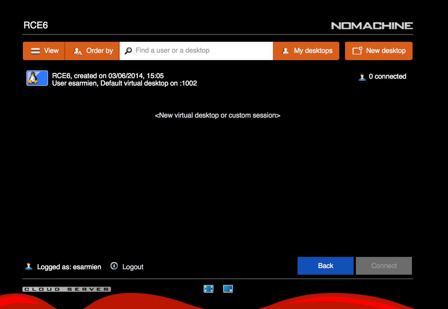
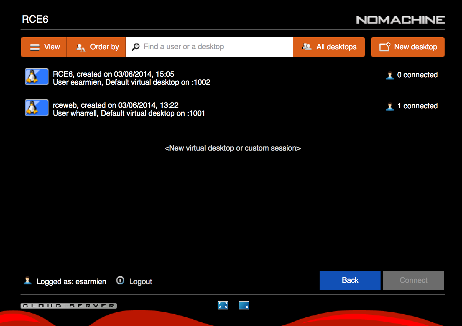
I’m deploying NoMachine Cloud Server 4.2.24 widely for our academic staff at Harvard-MIT Data Center and one problem that staff highlights is the confusing labeling of the button ‘My Desktops/All Desktops.’
When a user logs into the NXHTD web interface or through the NoMachine client, they either see ‘All Desktops’ or ‘My Desktops’. However, when you click ‘My Desktops’, you see everyone’s desktops. Whereas, when you click ‘All Desktops’, it changes to ‘My Desktops.’ To put it another way, when you are viewing only your sessions, the button is labelled ‘My Desktops’, but clicking ‘My Desktops’ reveals ‘All Desktops’. Instead, I hope that you consider making these two separate buttons or simply a dropdown box. We have seen situations where users are attempting to connect to other users’ desktops mistakenly and believing they are unable to connect to their own sessions.
I am including two screenshots.
Best,
Evan
June 5, 2014 at 11:45 #3813BritgirlKeymasterI understand where you’re coming from, and your suggestions are valid proposals. Two buttons, though, is not possible because we need the space for another button (in a future version). There is actually a dropdown box which appears with a long key press. Changing how that menu is visualized would mean changing it for all other buttons which have menus activated with long key presses, and in some of those cases having a menu appear immediately would interfere with what’s below it all the time. The UI you see is the result of a lot of painstaking design and thought, and it’s not so easy to change things overnight, but we will put our thinking caps on 🙂
Would a brief guide be useful for your users? We can certainly add one and then you can point your users to it.Another solution could be to disable desktop sharing if your users only need access to their own sessions. You can do this in profiles. This won’t disactivate the button, but regardless of whether they are enticed to clicking “My desktops” or not, they will only ever see their own.
June 6, 2014 at 10:49 #3814esarmienParticipantHi Britgirl,
I understand that your interface was built over a long period of time, with a lot of input and testing. I think I may have a really easy solution to address this. Can you simply *change* the label of the button? For example, when you are viewing ‘My Sessions’ the label says ‘All Sessions’, such that it is obvious what action that button performs. Even better, could you add a verb to the label? ‘View My Sessions’, ‘View All Sessions’ ? That would be an easy solution I hope.
Again, thanks for your help
Best,
Evan
June 6, 2014 at 12:26 #3827TorParticipantHello esarmien!
I have to say that you are the first person to have reported this particular problem of the label not being clear. The UI has been designed so that the user, when landing on the desktop list, shouldn’t have to click anything other than click the session that belongs to him. Of course, this won’t stop the user from exploring what buttons do and so on!Let’s not confuse ‘stateful buttons’ (View, Order by, My/All desktops), which let you configure how you want to view the desktop list, and ‘action buttons’ (e.g New desktop, Back, Connect) which prompt you to do something.
All the state buttons follow the same logic, i.e. the icon you see in the button is the configuration that you have in front of you. So when you see “My desktops”, you are already viewing your desktops. Adding a verb to the button, if there was space, wouldn’t solve the problem for the handful of your users who click on it. They would still click on it because they believe that by clicking on it they will see their desktops, when in fact they are already seeing their desktops.
As Britgirl mentioned, changing the logic of one button, means changing it for all the other buttons. What we need to come up with is a better label that communicates that your are already viewing your own desktops, and that by clicking on the button you will view yours and everybody else’s.
The suggestion provided by Britgirl about disabling desktop sharing could be a viable workaround if your users don’t need to share. In the meantime, we’ll evaluate what other options are possible to improve this label.
Thanks anyway for your suggestions and comments.
June 10, 2014 at 09:32 #3829esarmienParticipantThank you both for considering this suggestion. I’m glad that you’re considering coming up with a better label that communicates desktop view. In the meantime, I understand you can disable desktop sharing. However, we do not want to disable desktop sharing for all users. Administrative users in the group admin should be able to connect to others’ desktops if our users so request. Is there a configuration option whereby I can disable desktop sharing for certain users and groups?
Thanks,
Evan
June 10, 2014 at 10:06 #3866BritgirlKeymasterIf you are using Terminal Server, Enterprise Server or Cloud Server, you have Profiles available:
https://www.nomachine.com/DT09K00058#3.4.
https://www.nomachine.com/DT09K00058#4.1.
Profiles can be for:
–system
–user USERNAME
–guest
–node NODE
–group GROUPMore information is in the Administrator’s Guide linked above.
For example, nxserver –ruleadd –class session –type shadow –value no –group groupname
June 10, 2014 at 10:11 #3839bklevenParticipantHi,
Just to add another person’s perspective…
I also find this confusing. Firstly, I don’t believe it is very common to use stateful buttons but I don’t review software for a living so perhaps it’s more commonly used than I would suspect due to my particular software usage.
However, whenever I do see stateful buttons I have rarely seen them mixed with action buttons without some visual cue distinguishing them so the user immediately is aware that something is different about them.
I found myself hovering the pointer over the buttons in the hopes that I would get some sort of ‘tooltip’ (or whatever terminology you prefer) providing some hint of how to use the button to accomplish what I was after. I had no idea that the longpress was even an option until I read this thread. Having a hint which states ‘Click and hold to see all options’ or something similar would reveal the functionality.
An example is the Sort button in the connection panel. I clicked it and saw the icon changing and the sort order changing, but I didn’t know that I could longpress and I didn’t know what the changing icons on the button meant. So I was basically guessing what each sort mode was actually doing.
I would like to say I definitely appreciate the UI changes as a whole – this is a big improvement over 3.x. However, there are a few rough edges here and there and my colleagues have express frustration when using the new 4.x client because there is functionality in the UI that isn’t very discoverable. I realize there are the hint screens but many people I know prefer to call them nag screens and immediately search for the checkbox to ‘don’t show this again’. Sure, they shouldn’t do that without being sure what the screen says but they do it anyway.
Thanks for listening!
Kleven
June 19, 2014 at 13:50 #3975BritgirlKeymasterThanks for everyone’s suggestions and ideas. We’ll start evaluating what can be done.
-
AuthorPosts
This topic was marked as solved, you can't post.